Are you tired of sitting through boring and undergoing PowerPoint presentations? Do you want to learn to captivate your audience to stand out in your presentation? Look no further! This article compiles some professional tips and tricks on the best PowerPoint presentation. From creating eye-catching visuals to delivering a compelling message, you’ll learn everything you need to know to create a presentation that truly wows your audience. So let’s get started!
Tips for Designing Effective PowerPoint Presentations
A great PowerPoint presentation can be a powerful tool to communicate your message, but designing effective slides can be challenging. Here are some proven tips for effective PowerPoint slides:
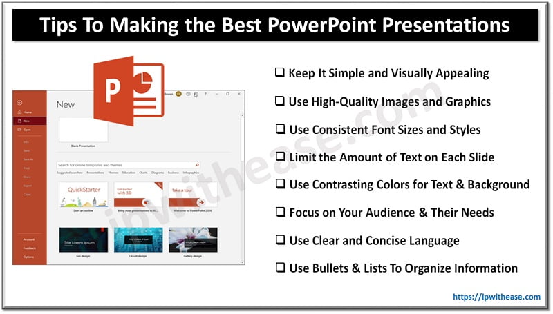
1. Keep It Simple and Visually Appealing
A simple, clean slide design can help your audience focus on your message and avoid distractions. You can achieve simplicity by using minimal elements, such as text, images, shapes, etc., and arranging them neatly and symmetrically. You can also use white space to create contrast and emphasis. A visually appealing slide design can help your audience stay interested and engaged.
2. Use High-Quality Images and Graphics
Images and images can improve slides by adding visual appeal, explaining points, showing data or processes, etc. Use clear, crisp, and polished photos and designs. Avoid using low-quality images and blurry, pixelated, stretched, or distorted graphics. You should also avoid using too many images and graphics that can clutter your slides or overwhelm your audience. Consider using PowerPoint design services if you need more confidence in creating visually appealing PowerPoint presentations.
3. Use Consistent Font Sizes and Styles
Font sizes and styles can affect the readability and appearance of your slides. You must use consistent font sizes and styles throughout your presentation to create a uniform and coherent look. You should use only a few different fonts or font sizes that can make your slides look messy or confusing.
4. Limit the Amount of Text on Each Slide
Text is an important element of your slides, as it conveys your main points, facts, examples, etc. However, you need to limit the text on each slide to ensure your audience is manageable. You should use shorter paragraphs or sentences that can make your slides look crowded or dense.
5. Use Contrasting Colors for Text and Background
Colors can affect the mood and impact of your slides. You need to use contrasting colors for the text and background to make your text stand out and be easy to read. You should avoid using colors that are too similar or bright, which can make your text blend in or strain the eyes.

Tips For Creating Effective PowerPoint Content
Creating content that resonates with your audience is the key to a successful PowerPoint presentation. Leverage the following tips for successfully writing engaging PowerPoint content.
1. Focus on Your Audience and Their Needs
You need to know who you are presenting to and what they expect from your presentation. Who are your audience members, and what are their backgrounds, interests, preferences, and concerns? What are their needs and problems that you can address or solve with your presentation? Focusing on your audience and their needs will help you tailor your content and style to suit them and make them more interested and engaged.
2. Use Clear and Concise Language
You need to use language that is easy to understand and follow for your audience. You need to avoid using jargon, slang, acronyms or technical terms that your audience may not be familiar with or may confuse them. You must also avoid using long or complex sentences that may make your content hard to read or comprehend. You need to use simple, direct and precise words that convey your meaning clearly and concisely.
3. Use Bullet Points and Lists To Organize Information
You can use bullet points and lists to organize your information into logical and manageable chunks. You need to refrain from using paragraphs or blocks of text that may make your slides look crowded or dense. You must use only a few bullet points or lists that may make your slides cluttered or overwhelming, and use your speech to elaborate on them. You can always hire a professional graphic design service provider to do the job for you.
Conclusion
Remember, a great PowerPoint presentation can make all the difference in getting your message across effectively. By following these tips, you’ll be on your way to creating presentations that are not only visually appealing but also informative and engaging. So go forth and dazzle your audience with your newfound presentation skills!
Continue Reading:
Google Slides : Google’s answer to Online Presentation program
Difference between Operating system & Application Software
ABOUT THE AUTHOR
IPwithease is aimed at sharing knowledge across varied domains like Network, Security, Virtualization, Software, Wireless, etc.


