Table of Contents:
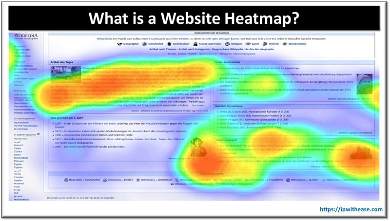
A Website Heatmap is a visual representation of the hidden patterns that help in understanding user behavior on your website. You’ll find what’s catching attention, what’s being quantified and ignored, and use it to optimize for better engagement.
In this blog, we will explore different website heatmap types, and learn how they can help your path to business growth.
Understanding Website Heatmap
A website heatmap uses a colour palette of hot and cold to depict the high and low quantitative patterns. The term “heatmap” was given by a software designer named Cormac Kinney in early 1990s. He created a tool for the visual graphical representation of user data interest.
There are 4 major types of website heat maps. Each type provides unique insights into user behavior, illuminating areas of user interaction. Understanding and analyzing with the available tools like Quantum Metric reveals what draws user attention and intrigue and where your site might fall short.

Types of Website Heatmap
Click and tap Heatmaps
By analyzing click-and-tap heatmaps, you’re gaining invaluable insights into how visitors interact and users’ behavior on your website. These website heatmap types illustrate where visitors click and tap, allowing you to understand how users interact with your site.
These click maps can show if your users are clicking on non-clickable elements or ignoring your most important features. These insights can help you optimize your site’s design and improve user experience.
Scroll Heatmaps
In addition to the insights from click-and-tap heatmaps, scroll heatmaps reveal how much of your page users are viewing. Scroll maps provide a visual representation of users’ scroll behavior. They show you how far down visitors are scrolling, called scroll depth, and what web page sections they spend the most time on.
Analyzing a scroll map, you’ll notice patterns in visitor scrolling behavior. They may not be reaching vital parts of your entire page, or maybe there’s a specific section or landing page that consistently loses their attention. With this information, you can optimize your page layout to ensure essential elements are placed where they will most likely be seen.
Move Heatmaps
Move heatmaps visualize the movement of your site visitors and contribute to a better understanding of their behavior. These mouse-tracking heatmaps record where users navigate your website, showing hotspots where the cursor lingers. This mouse-tracking heatmap tool provides invaluable insight into user behavior.
You’ll notice patterns like users often move their mouse where they look, so high activity areas on your move heatmap likely indicate points of interest. Conversely, areas with minimal activity mightn’t be capturing the user’s attention. This detailed, user-focused analysis empowers you to optimize your website design and content placement.
Eye-tracking Heatmaps
Eye-tracking heatmaps show where users focus their gaze on your website. This powerful tool graphically represents user attention data, pinpointing the exact spots on web pages that catch a visitor’s eye. By offering a detailed insight into which essential page elements are capturing attention, it can help you optimize your site design and content.
Eye tracking heatmaps accurately measure eye movement, painting a vivid picture of user behavior. Are they drawn to headlines, images, or calls to action? This information lets you know where to place your most critical content.
Comparison: Click-and-tap vs Scroll vs Move vs Eye-tracking Heatmaps
| Types of Website Heatmaps: Comparison Table | ||||
| Feature | Click and Tap | Scroll | Move | Eye-tracking |
| Input Method | Clicking or tapping | Scrolling | Moving cursor or pointer | Eye movement tracking |
| Interaction Type | Direct interaction | Indirect interaction | Indirect interaction | Passive observation |
| Primary Use Cases | Navigating links, buttons | Scrolling through content | Navigating UI elements | Analyzing user attention |
| Data Captured | Clicks and taps | Scroll depth | Cursor movement | Gaze points and fixation |
| Feedback Provided | Interaction frequency | Scroll depth metrics | Cursor trajectory | Areas of visual focus |
| Insights Gained | Popular clickable areas | Content engagement | User attention patterns | Visual hierarchy analysis |
| Implementation Ease | Easy | Easy | Moderate | Complex |
| Tools Required | Click tracking software | Analytics tools | Analytics tools | Eye-tracking hardware & software |
| Privacy Implications | Minimal | Minimal | Minimal | Potential privacy concerns |
| Real-time Feedback | Yes | Yes | No | No |
Benefits of Website Heatmaps
- Understanding User Behaviour: Website heatmaps are a powerful tool that visualizes complex data sets, making it easier to pinpoint where visitors focus their attention on your site. This data analysis provides a high level of detail about visitor behavior.
- Website Optimization: From this, you’ll gain actionable insights to optimize your website. You might discover, for instance, that certain landing pages of your site aren’t getting the attention you thought they were. Equipped with this knowledge, you can make targeted improvements to boost engagement and conversion rates.
- Identifying Roadblocks: Heatmaps can also help you identify potential roadblocks in your user journey. If visitors consistently drop off at a specific point on the checkout page, that’s a clear sign something isn’t working. Once you’ve identified and addressed these issues, you’ll be well on your way to driving business growth.
Recognizing the limitations of heatmaps
You’ve probably used different types of heatmaps to visualize complex data on your website. They’re great for showing where user interactions are highest, but they aren’t without flaws.
If you do not recognize the limitations of heatmaps, you risk misinterpreting your website heatmap data. For instance, heatmaps can’t distinguish between accidental and intentional interactions. A user might hover over an area while reading, creating a heat map of a hotspot that doesn’t necessarily indicate interest.
Another limitation is that heatmaps don’t explain why users behave a certain way. A hotspot might indicate that users are attracted to an element, which could mean they’re confused by it. It’s tough to say without additional context and the help of analytics tools.
Last words
Website heatmaps highlight user behavior like navigation and compass. They’re not just pretty pictures but powerful tools for business growth, illuminating the path to an improved user experience. But remember, they’re not miracle workers. Like any tool, it has its limitations. So, harness their power wisely, blend them with other tools, and watch your digital landscape evolve to suit your users’ needs better.
ABOUT THE AUTHOR
IPwithease is aimed at sharing knowledge across varied domains like Network, Security, Virtualization, Software, Wireless, etc.


